Sentry Page Protection
Data Analysis [2-15]
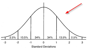
Normality Test
You are often required to check and ensure the data follows a normal distribution prior to many statistical analysis.
This can be done by using:
- (1) Numerical Method or
- (2) Graphical Method
Example
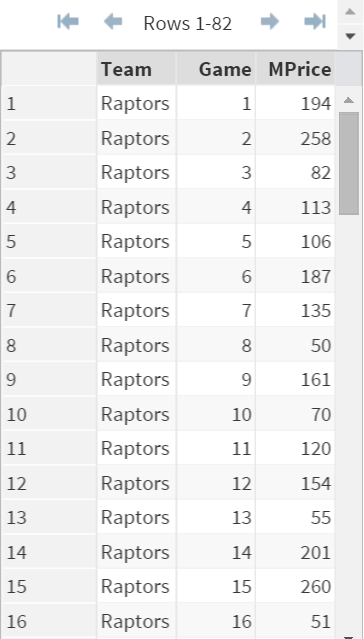
Note: there are 82 observations in this data set. Not all of them are shown in the image above.
The TICKET data set contains 3 variables:
- Team: Raptors (GO RAPS GO)
- Game: The nth game of the season
- MPrice: Median Ticket Price
An analyst is interested in checking whether the median selling price (i.e. MPrice) follows a normal distribution.
1. Numerical Method
The numerical method is based on 4 normality test results.
Example
Proc Univariate Data=Ticket normal;
Var Mprice;
Run;
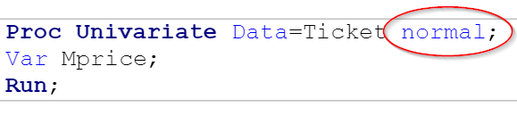
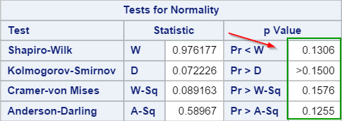
Adding the NORMAL option to Proc Univariate creates an additional table with the list of normality tests in the output:
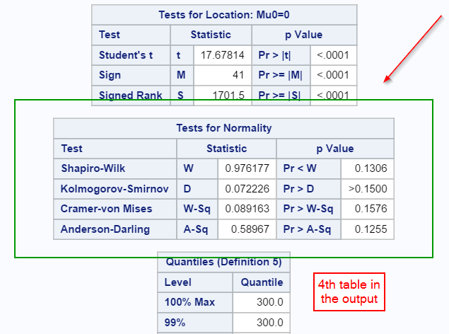
Note: this is the 4th table in the output.
The numerical method looks at the 4 normality testings:
Since all of the p-values are greater than 0.05, the median ticket price is assumed to be normally distributed.
The numerical method looks at the 4 normality testings:
- Shapiro-Wilk
- Kolmogorov-Smirnov
- Cramer-von Mises
- Anderson-Darling
Since all of the p-values are greater than 0.05, the median ticket price is assumed to be normally distributed.
Quick Resources to learn about:
2. Graphical Method
The graphical method looks at the stem-and-leaf plot, box plot, and normality probability plots as well as the histogram.
Example
Proc Univariate Data=Ticket plots;
Var Mprice;
Histogram;
Run;
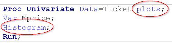
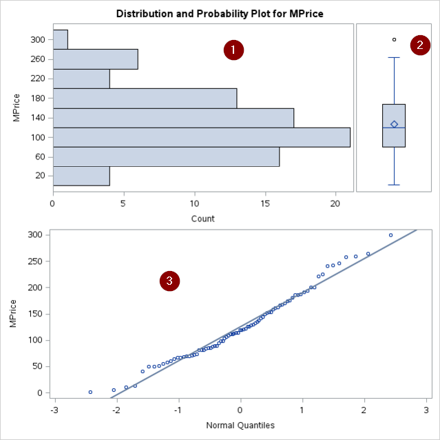
The PLOTS option generates 3 plots:
- Stem-and-leaf plot (or a horizontal bar chart)
- Box plot
- Normal probability plot
The HISTOGRAM statement plots the histogram as well:
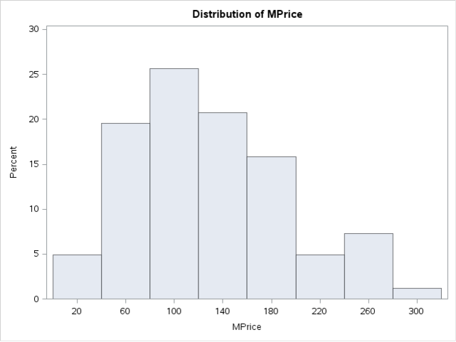
All of the graphs show a distribution that is fairly close to a normal distribution.
Quick Resources to learn about:
Exercise
Locate the CARS data set from the SASHelp library.
Analyze whether the MSRP follows a normal distribution using both the numerical and graphical methods.
What would be your conclusion and why?
Locate the CARS data set from the SASHelp library.
Analyze whether the MSRP follows a normal distribution using both the numerical and graphical methods.
What would be your conclusion and why?
Need some help?
HINT:
What are the p-values from the normality tests? How do the plots look like?
SOLUTION:
Proc Univariate Data=SASHelp.cars normal plots;
Var MSRP;
histogram;
Run;
The data does not seem to be normally distributed.
The p-values are all less than 0.05, which rejects the hypothesis that the data is normally distributed.
Both of the bar chart and box plot show asymmetric distribution with the majority of the MSRP falling in the range of $15,000 to $45,000.
The normal probability plot bends up to the left of the normal line. This shows a long tail to the right.
Fill out my online form.