Sentry Page Protection
Data Analysis [12-15]
Histogram
You can also visualize the frequency statistics by plotting the histogram from Proc Freq.
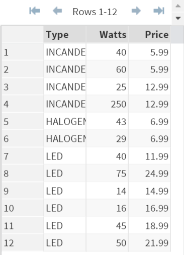
Let's take a look at the BULBS data set again.
Example
Let's take a look at the BULBS data set again.
Example
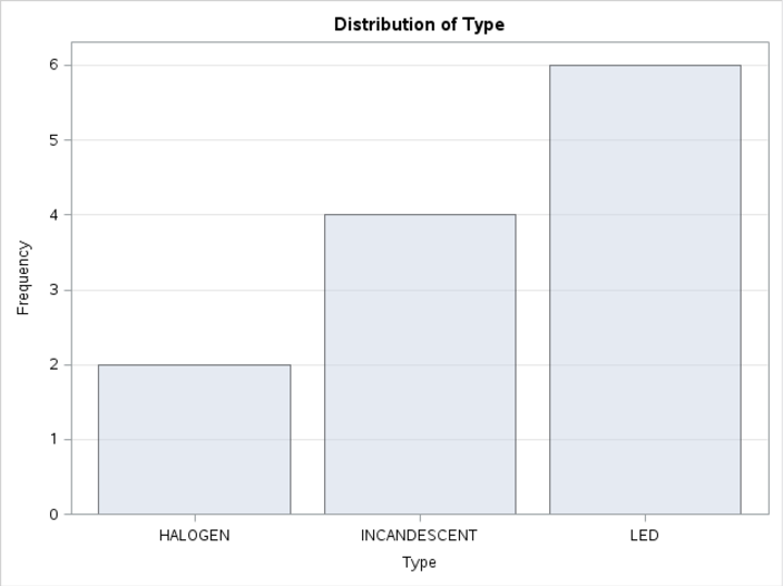
The histogram can be plotted by adding the PLOTS option in the TABLE statement:
Example
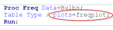
Proc Freq Data=Bulbs;
Table Type / plots=freqplot;
Run;
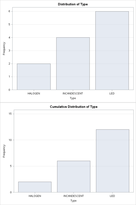
The option (plots=freqplot) plots the histogram of the frequency statistics:
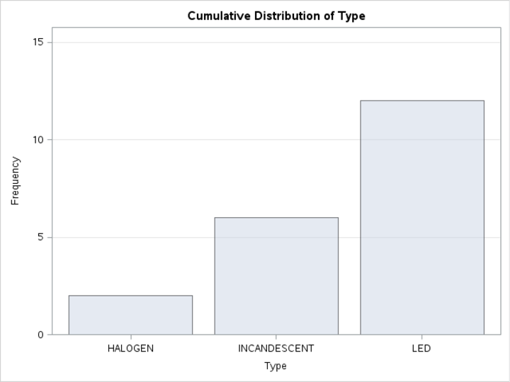
Another plot that are commonly plotted is the cumulative frequency plot.
It can be plotted by using the (plots=cumfreqplot) option:
Example
Proc Freq Data=Bulbs;
Table Type / plots=cumfreqplot;
Run;
Finally, you can plots both plots using the (plots=all) option:
Example
Proc Freq Data=Bulbs;
Table Type / plots=all;
Run;
Exercise
Locate the CARS data set from the SASHelp library.
Count how many types of cars are built by each car maker.
Which car maker makes the most variety of cars in this population?
[Hint: it is much easier to find the result using the histogram.]
Locate the CARS data set from the SASHelp library.
Count how many types of cars are built by each car maker.
Which car maker makes the most variety of cars in this population?
[Hint: it is much easier to find the result using the histogram.]
Need some help?
HINT:
Simply use Proc Freq on the Make variable.
SOLUTION:
Proc Freq Data=SASHelp.cars;
Table Make / plots=freqplot;
Run;
From the histogram, Toyota makes the most variety of cars in this population.
Fill out my online form.