Sentry Page Protection
Simple Linear Regression [2-17]
How well does past performance predict future performance?
Before we fit a linear regression model to the data, we have to make sure there is a linear relationship between the response variable and the predictor variable.
Why?
If we find out the student's past performance does not correlate to their future performance, using the past to predict the future does not really make sense.
Let's look at the SCHOOL example again.
Copy and run the code from the yellow line below if you haven't done so.
Why?
If we find out the student's past performance does not correlate to their future performance, using the past to predict the future does not really make sense.
Let's look at the SCHOOL example again.
Copy and run the code from the yellow line below if you haven't done so.
Again, the SCHOOL data set contains a list of 20 students and their English class results in grade 9 and grade 10.
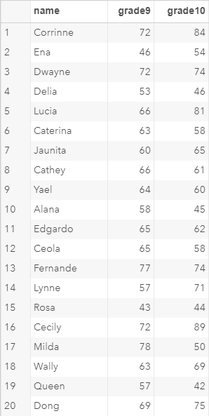
One way to explore the relationship between the variables is to plot the variabels on a scatter plot.
Example
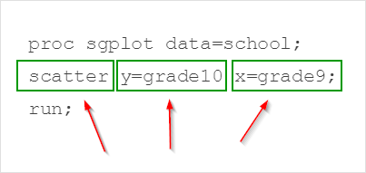
proc sgplot data=school;
scatter y=grade10 x=grade9;
run;
scatter y=grade10 x=grade9;
run;
In this example, the SGPLOT procedure plots the GRADE10 column on the y-axis and the GRADE9 column on the x-axis.
From the scatter plot, you can see an upward trend with a possible outlier.
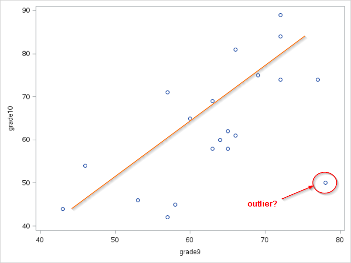
This does not statistically confirm that the grade 9 and grade 10 results are linearly correlated.
However, it does seem that there is a linear association between the two results.
A linear regression model seems to be the right model for the data.
When is a linear regression model NOT appropriate?
Let's look at a few more examples of the different scatter plots.
Copy and run the code from the yellow line below:
Let's look at a few more examples of the different scatter plots.
Copy and run the code from the yellow line below:
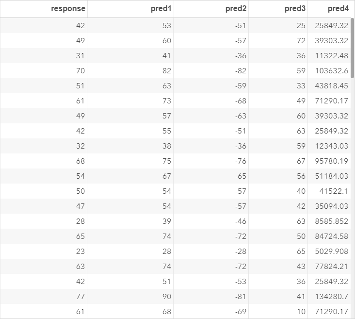
The EX1 data set contains five columns:
- RESPONSE
- PRED1
- PRED2
- PRED3
- PRED4
Example 1: Positive Association
Let's plot the RESPONSE variable and PRED1 variable on the scatter plot:
proc sgplot data=ex1;
scatter y=response x=pred1;
run;
scatter y=response x=pred1;
run;
The plot shows a positive association between RESPONSE and PRED1.
When PRED1 increases, RESPONSE also increases.
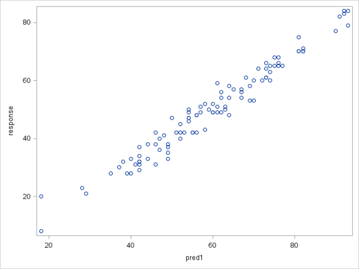
A linear regression model seems to be an appropriate model for the data.
Example 2: Negative Association
Let's plot the RESPONSE variable and the PRED2 variable on the scatter plot:
proc sgplot data=ex1;
scatter y=response x=pred2;
run;
scatter y=response x=pred2;
run;
The plot shows a negative association between RESPONSE and PRED2.
The PRED2 increases, RESPONSE descreases.
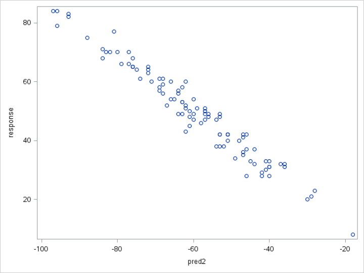
A linear regression model also seems to be an appropriate model for the data.
Example 3: No Association
Now, let's plot the PRED3 variable and RESPONSE variable on the scatter plot:
proc sgplot data=ex1;
scatter y=response x=pred3;
run;
scatter y=response x=pred3;
run;
The plot shows no association between RESPONSE and PRED3.
When PRED3 goes up, RESPONSE stays roughly the same.
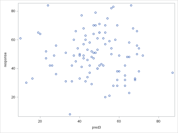
The PRED3 variable does not seem to be a good predictor of the RESPONSE variable.
Example 3: Non-linear Association
Let's plot the PRED4 variable and RESPONSE variable on the scatter plot:
proc sgplot data=ex1;
scatter y=response x=pred4;
run;
scatter y=response x=pred4;
run;
There is clear an association between RESPONSE and PRED4.
However, the association does not seem to be linear.
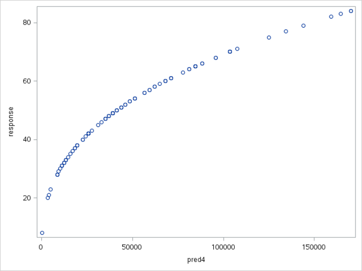
A linear regression model might not be an appropriate model for the data without any transformation on the variables.
Note: variable transformation will be discussed in future module.
In the next section, we will learn how to formulate an equation that is considered the best "fit" for the data.
Exercise
Locate the FISH data set from the SASHelp library.
A researcher is interested in learning more about the association between fish weight and length.
Plot a scatter plot with the WEIGHT variable on the y-axis and LENGTH3 on the x-axis.
Does the plot show a linear relationship between the two variables?
Need some help?
Fill out my online form.