Sentry Page Protection
Time Series Modeling
[5-15]
[5-15]
In the last section, we have learned how to compute the autocorrelation of the total sales at various lagged time points.
Let's look at how you can create the ACF plot that summarizes the results.
If you haven't created the SALES3 data set, copy and run the code from the yellow box below:
ACF Plot
The ACF plot can be plotted using the TIMESERIES procedure.
ACF Plot
The ACF plot can be plotted using the TIMESERIES procedure.
proc timeseries data=sales3 plots=acf;
var totalsales;
run;
var totalsales;
run;
The PLOTS=ACF option tells SAS to plot the ACF plot:
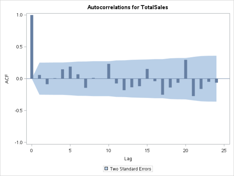
Interpreting the ACF Plot
The ACF plot shows the autocorrelation at different lagged time points.
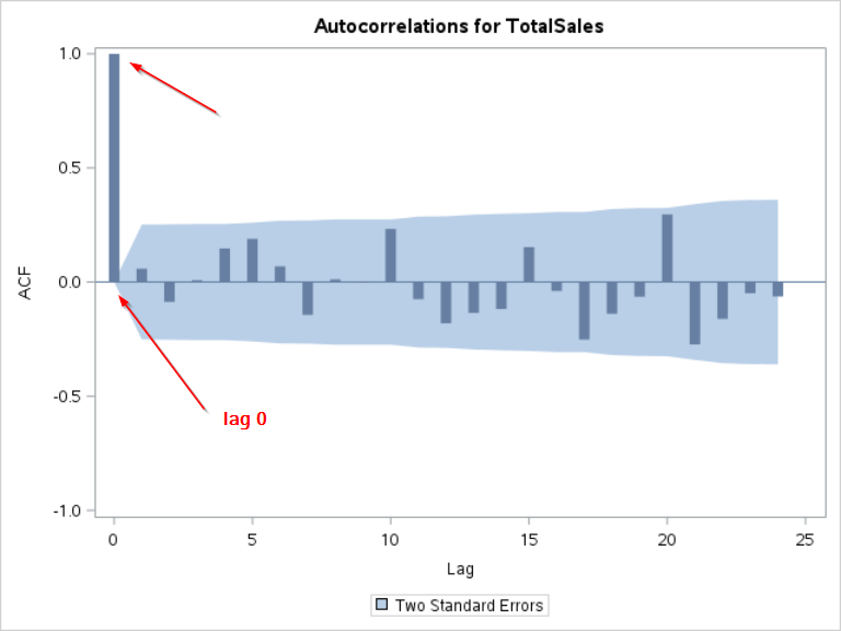
The autocorrelation at lag 0 is the correlation with no lag.
The correlation with itself is always equal to 1:
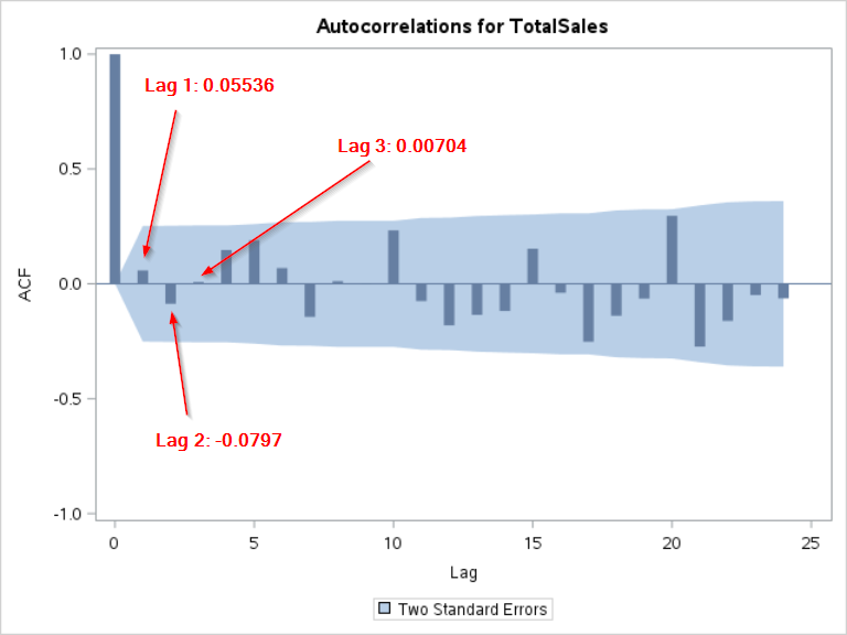
Remember the autocorrelations we computed in the last sections?
Lag 1: 0.05536
Lag 2: -0.0797
Lag 3: 0.00704
These match our ACF plot at lag 2, 3 and 4:
The ACF plot also shows the blue area, which is the 95% confidence interval for the autocorrelation estimate.
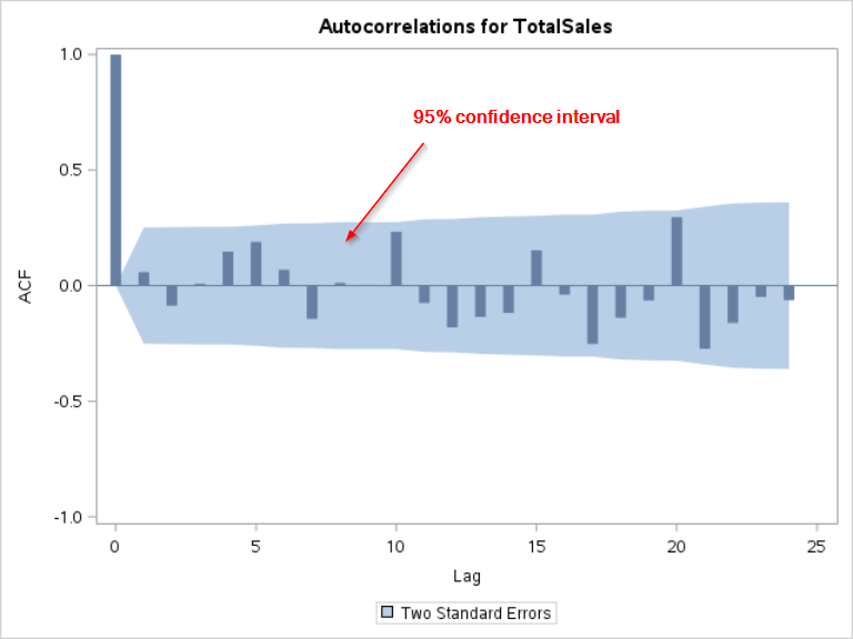
All of the autocorrelations are within the 95% confidence limits.
The current day's sales are not significantly correlated with past sales.
Does this mean the sales forecast should not be based on past sales?
Not necessarily.
In the next section, we will look at the partial autocorrelation plot (PACF), which contains additional information about the relationship between the sales at different time points.
Exercise
Plot the ACF for the order type A (i.e. ORDERTYPEA variable).
Does the plot show significant spikes?
Plot the ACF for the order type A (i.e. ORDERTYPEA variable).
Does the plot show significant spikes?
Need some help?
Fill out my online form.