Sentry Page Protection
Time Series Modeling
[9-15]
[9-15]
Seasonal Differencing
Seasonal differencing can be used to stabilize seasonal spikes in a time series.
Let's look at an example below.
Seasonal differencing can be used to stabilize seasonal spikes in a time series.
Let's look at an example below.
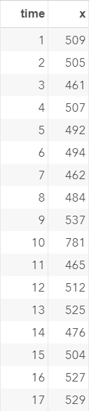
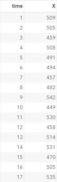
The EX5 data set contains another set of simulated values.
As usual, we'll plot the time series, ACF and PACF:
proc arima data=ex5;
identify var=x;
run;
quit;
identify var=x;
run;
quit;
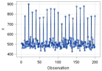
The time series plot shows seasonal spikes every 10 days:
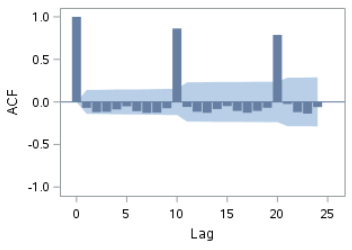
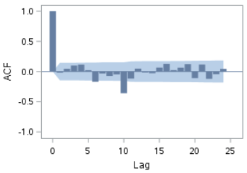
The ACF plot shows seasonal spikes as well:
We are going to try a seasonal differencing with seasonality=10.
Example
proc arima data=ex5;
identify var=x(10);
run;
quit;
identify var=x(10);
run;
quit;
The plot after differencing shows some promising results.
The means are stabilized:
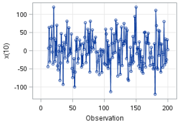
The ACF plot still has spikes at certain lags. However, it is quite an improvement over the ACF plot before differencing.
Stabilizing Unequal Variance
When a time series shows increasing or decreasing variance over time, a transformation might be able to fix the issue.
Let's look at an example.
The EX6 data set, as usual, contains a list of simulated values:
Let's plot the time series.
proc arima data=ex6;
identify var=x;
run;
quit;
identify var=x;
run;
quit;
You can clearly see the time series becoming more volatile as time passes:
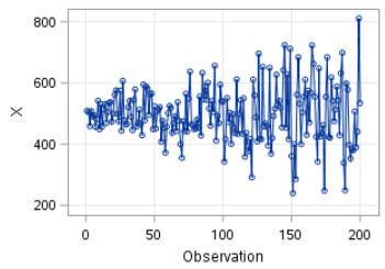
Note: the range of X goes from 200 to 800:

Now, let's plot the time series with log transformation on X:
data ex6a;
set ex6;
y = log(x);
run;
proc arima data=ex6a;
identify var=y;
run;
quit;
set ex6;
y = log(x);
run;
proc arima data=ex6a;
identify var=y;
run;
quit;
The time series plot for log(y) is shown below:
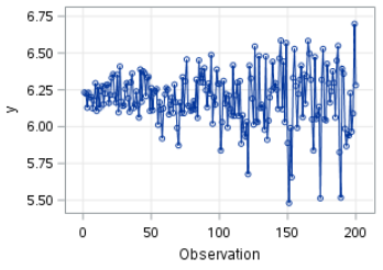
The variance didn't seem to be stabilized.
It still shows the same structure as before.
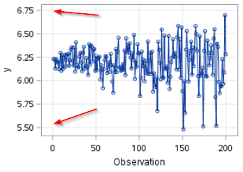
However, if you look at the range of the log(x) value, you will see the range has shrunk to 5.5 to 6.75:
We are going to plot the time series again, but with a wider range.
This can be done using the SGPLOT procedure:
data ex6a;
set ex6;
y = log(x);
run;
proc sgplot data=ex6a;
series y=y x=time;
yaxis values= (0 to 10) grid;
xaxis grid;
run;
set ex6;
y = log(x);
run;
proc sgplot data=ex6a;
series y=y x=time;
yaxis values= (0 to 10) grid;
xaxis grid;
run;
You will see that there is a huge improvement in the variance of the time series.

In the next section, we will learn more about the Autoregressive (AR) model.
Exercise
Locate the AIR data set from the SASHelp library.
The AIR data set contains airline passenger data for January, 1949 to December, 1960.
This is a well-known example used for time series analysis.
See Time Series: Forecast and Control by Box, Jenkins and Reinsel (ISBN: 978-0470272848).
Task 1:
Plot the time series, ACF and PACF of the airline passenger data.
Task 2:
Does the time series data look stationary?
If not, use various techniques to transform the series into an approximate stationary series.
Need some help?
Fill out my online form.