Sentry Page Protection
Time Series Modeling
[6-15]
[6-15]
The Partial Autocorrelation function is another concept that is essential to the understanding of time series analysis.
It is defined as the partial correlation of a variable with its lagged values that is not explained by the shorter lags.
This definition is confusing. Let's look at the following example.
We will first simulate a series of data for variable X.
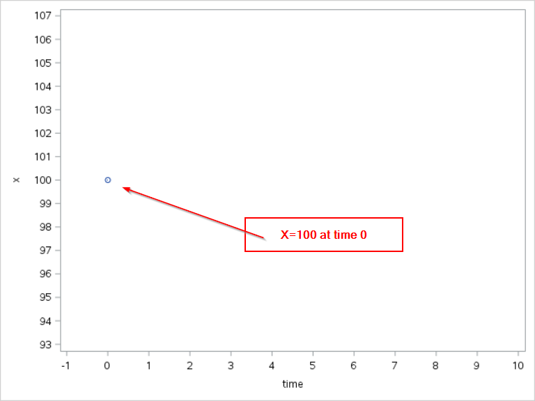
At time = 0
Let the initial value of X be 100.
X0 = 100
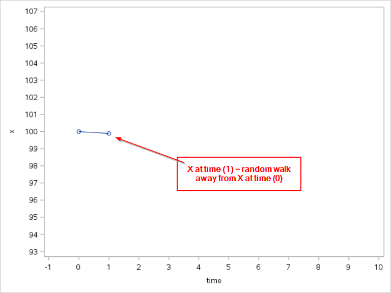
At time = 1
X at time 1 will be a random step away from X at time 0.
X1 = X0 + N1
where N1 is a random value generated from the normal distribution with µ=0 and σ=3.
For example, since X0 is 100, X1 is 100 + a randomly generated value based on the normal distribution with zero mean and a standard deviation of 3.
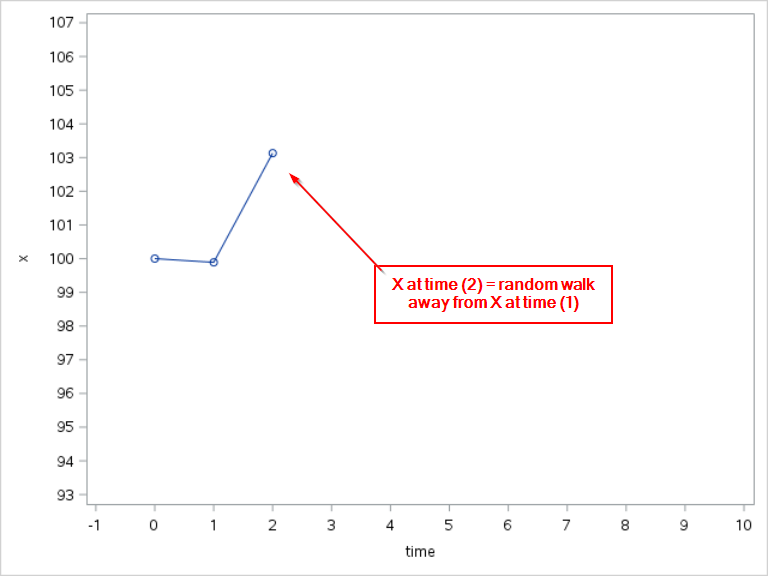
At time = 2
X at time 2 will also be based on X at time 1.
X2 = X1 + N2
X2 is again a random step away from X1.
At time = 2
X at time 2 will also be based on X at time 1.
X2 = X1 + N2
X2 is again a random step away from X1.
At time = t
In general, you can define Xt as:
Xt = Xt-1 + Nt
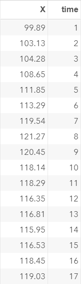
Now, let's run the code below to simulate X for 200 observations.
data ex2;
retain X 100;
call streaminit(222);
do time = 1 to 200;
X + round(rand('normal', 0, 3), 0.01);
output;
end;
run;
retain X 100;
call streaminit(222);
do time = 1 to 200;
X + round(rand('normal', 0, 3), 0.01);
output;
end;
run;
X is simulated for 200 observations:
Let's plot the time series as well as the ACF.
proc timeseries data=ex2 plots=(series acf);
var x;
run;
var x;
run;
The time series plot shows the movement of X:
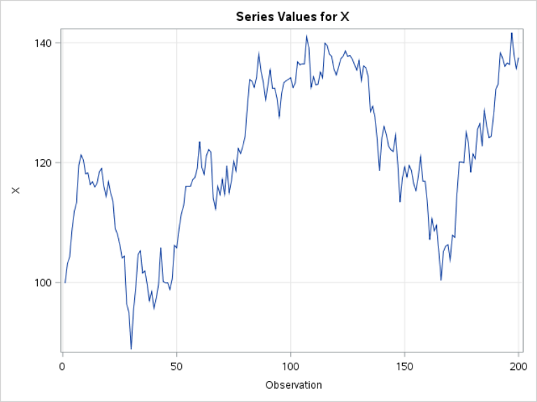
X starts off at 100 and moves between -90 to 150 over a period of 200 time points.
Let's look at the ACF plot:
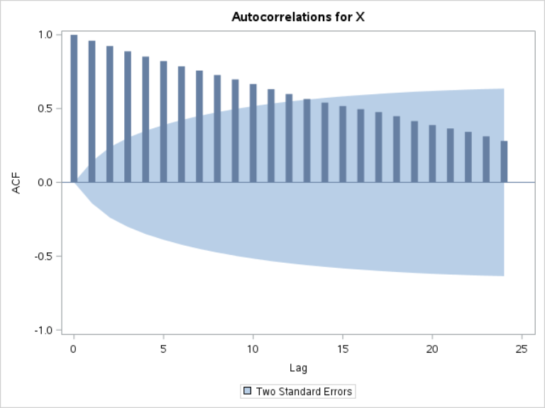
Unlike the ACF plot that we saw in the last section, the ACF plot for X slowly decreases to zero.
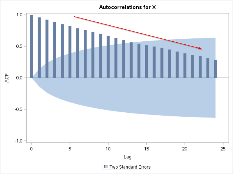
Let's focus on the autocorrelation at lag 1 for now.
The autocorrelation at lag 1 is the second bar in the plot. It is very close to 1:
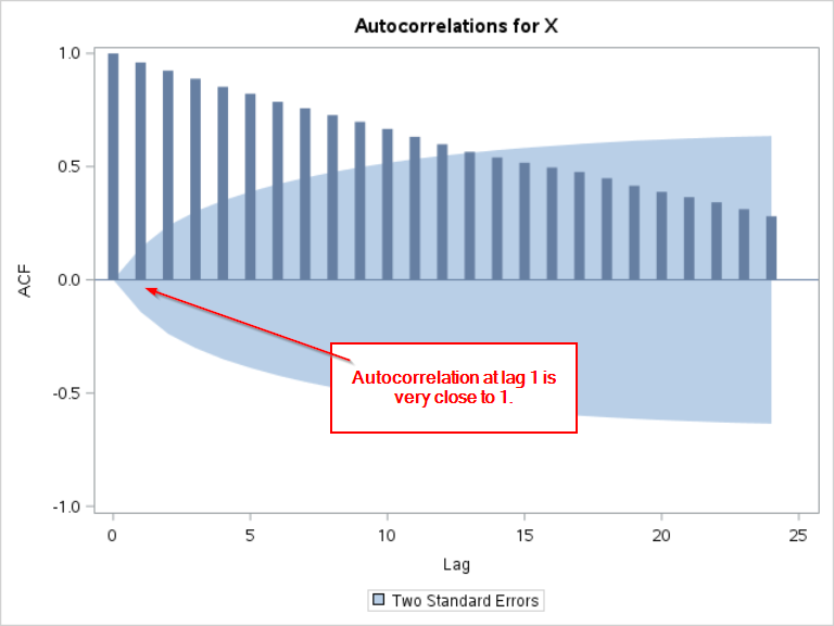
This indicates that X at time (t) is highly correlated with X at time (t-1).
This makes perfect sense considering how our data is simulated.
Xt = Xt-1 + Nt
X at time (t) is derived from X at the previous time point plus a small random error.
The values of X at two consecutive time points are definitely highly correlated.
Now, let's look at the autocorrelation at lag 2.
The autocorrelation at lag 2 is also very high.
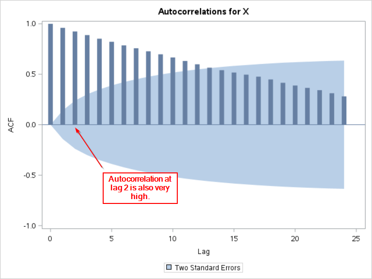
This indicates that X at time (t) is highly correlated with X at time (t-2).
This is a little strange!
Our Xt is derived from:
Xt = Xt-1 + Nt
Xt derives straight from Xt-1. It does not depend on Xt-2.
The high autocorrelation at lag 2 does not quite make sense.
It turns out that the high correlation between Xt and Xt-2 comes from the correlation between Xt-1 and Xt-2.
We have:
Xt = Xt-1 + Nt
and
Xt-1 = Xt-2 + Nt-1
As a result, Xt is indirectly correlated with Xt-2.
Partial Autocorrelation Function (PACF)
The PACF shows the partial autocorrelation of a variable with itself at lag t that is NOT explained by the shorter lag.
Let's first plot the PACF plot using the TIMESERIES procedure.
proc timeseries data=ex2 plots=(pacf);
var x;
run;
var x;
run;
The PACF plot is shown below:
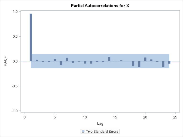
The partial autocorrelation at lag 1 is still very high.
There is a high correlation between Xt and Xt-1, as we have seen from the ACF plot.
However, unlike the ACF plot, the partial autocorrelation drops off immediately at lag 2:
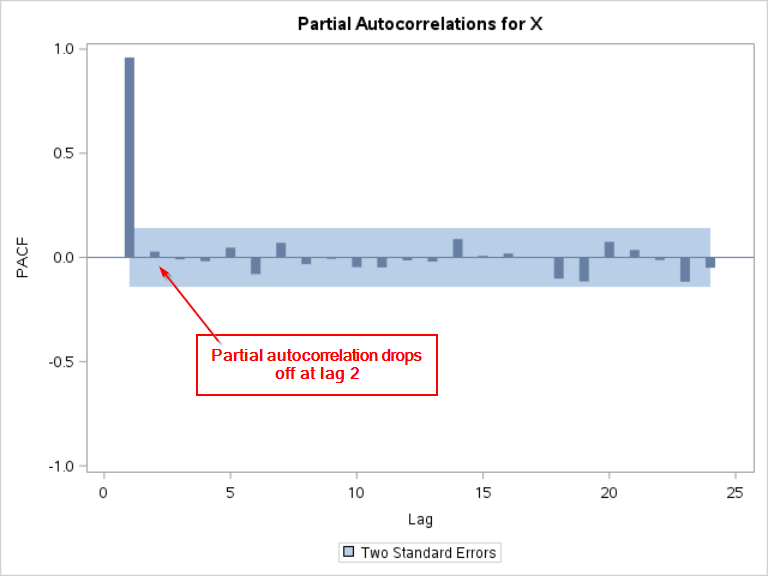
This indicates that the correlation between Xt and Xt-2 that is NOT explained by the correlation between X1 and Xt-1 is very small.
Xt is correlated with Xt-2 but it is mostly because of Xt-1.
Together with the ACF and PACF plots, we can further understand the correlation between the variable at different time points.

Further reading on PACF:
Exercise
If you haven't created the SALES3 data set, copy and run the code from the yellow box below:
If you haven't created the SALES3 data set, copy and run the code from the yellow box below:
Plot the PACF for the TOTALSALES column.
Do you see any spikes on the PACF plot?
Need some help?
Fill out my online form.